What is the Best Way to Make Sure Graphs Are Easy to Interpret
9 Easy Steps To Make Great Charts
How to tell exciting stories in presentation slides with elegantly re-organized charts

I am an analyst. I work with charts mostly—Charts for presentation, charts on dashboards, etc. However, most charts I see are overworked to look beautiful in the client's eyes. The truth is, they find it hard to understand them.
A useful chart is simple but not bland. It tells only one story and does it well. It speaks for itself and requires only minimal thinking to understand. Also, such charts use pleasant colors everyone can see.
This article is a practical guide. We will work through a messy bar chart and make it elegant. The focus here would be on presentation charts. However, most of these principles are useful for dashboards as well.
The average attention span for us is eight seconds. That's our goal — pitching the idea within eight seconds.
Background Information
I use this clustered column chart to explain the steps. It compares the television sales of 2020 with 2019 in many regions. The data used here is not real, and for illustration purposes only.

Sure, it looks beautiful. I'm a fan of dark backgrounds too. However, the purpose of the chart on a presentation is not to show off the presenter's skills or desires. It needs to be optimized for better reading.
In this chart, readers need to find out the story by themselves. I can see that sales in Asia dropped by about $2M, although it soared by $1M in America. But another person may focus on Africa and Europe, where the sales remain the same. If the message you want to discuss is the former one, the other one will create confusion. Not to mention, there could be many different ways your audiences interpret it.
Let's begin the cleanup step by step.
1. Prefer 2D graphics over 3D
3D graphics are beautiful, I agree. But we know that farther objects appear smaller than they are. In many cases, it leads to a false reading.
I've seen this on many dashboards because this simple tweak makes the chart more appealing. However, most data visualization experts would agree that 3D should not be used.
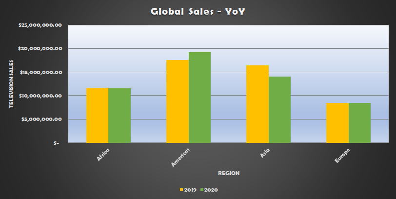
2. Use white backgrounds
White backgrounds are preferred for many reasons. First, it contrasts nicely with all other colors. White and gray go well together, whereas black and gray don't.
Second, white backgrounds work well on both printed and digital mediums.
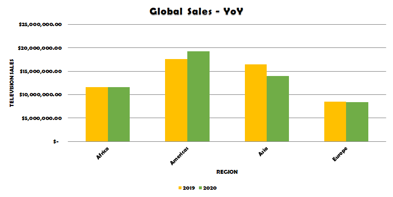
3. Organize content for the natural eye movement
Our eyes scan a chart from left to right and then top to bottom. Hence, place the critical elements at the top left. I start with a left-aligned title, and then the legends, then to the main chart.
It's good to use horizontal bar charts for nominal data and column charts for ordinal data. For example, if we create charts over multiple years, it's better to use a column chart. In this case, as we compare data across regions, which is nominal, horizontal bars are a good fit.
In addition to making the chart horizontal, I also made it ordered by the 2020 sales figures. It makes the chart easy to comprehend.
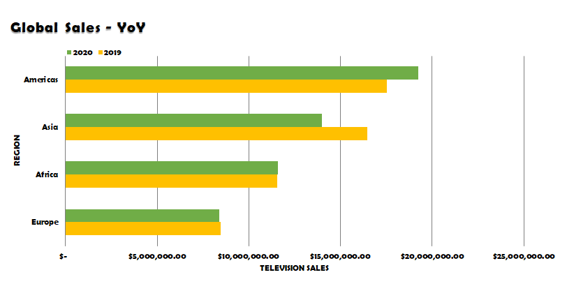
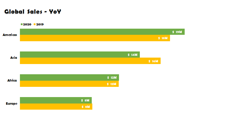
4. Labels are better than gridlines and axes
Gridlines and axes help with the precise measurements. They could help during the exploration. But in a presentation audiences will never use them. If your audience isn't going to use gridlines and axes to read the data, get rid of them. Fewer details make charts cleaner.
I like labels because they are closer to the data point and easy to understand.
5. Use pleasant colors
Choosing the right color for a presentation is a tricky thing. There are cool colors and warm colors. And some people cannot see all colors.
About one in 12 men and one in 200 women cannot see all colors. Among different types, red and green color blindness is the common one. Hence, for accessibility reasons, it's good to avoid these colors.
The blue and orange combinations work in most cases. Blue can be used to highlight something. Because blue is a cool color, people can gaze at it longer. Contrarily, we can use orange, the warm color, to draw immediate attention. I use gray for every other element because it doesn't compete for attention.
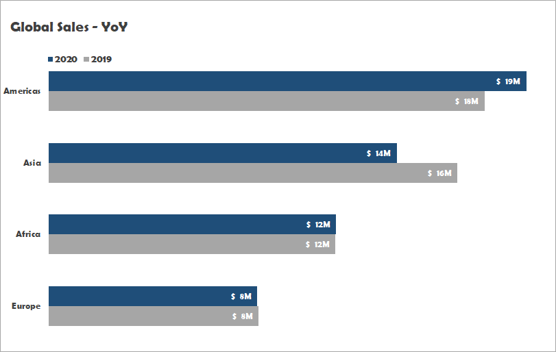
6. Use visual hierarchy to highlight the story
We placed elements on the natural eye movement, and we used pleasant colors in our design. There are other visual hierarchy techniques we can use.
Size and proximity
Size is an effective way to set the visibility of chart elements. We made all axis labels and data labels smaller because they do not directly contribute to the story.
Likewise, proximity helps to create logical groups with chart elements. We made the gap between two bars narrower than the width of any bar. We also made the gap between two data points (regions) wider than the gap between two bars in the same data point.
Typeface and typography
Sans-serif fonts are legible on presentations charts. Serif fonts work well for large texts like paragraphs. My favorite for charts is Calibri.
Also, light font weight helps not to distract the reader.
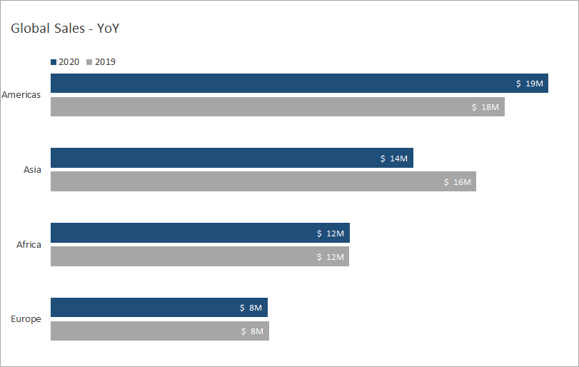
7. Use helper elements to catch the reader's attention
Helper elements are landmarks to drive the reader's attention in order.
Our story for this example was the drop in Asia and the gain in the Americas. I use an orange label closer to Asia's 2020 bar. Orange quickly catches attention and also tells the reader there is something odd.
I also use a blue label closer to the Americas' 2020 bar to tell the reader about the gain in American sales.
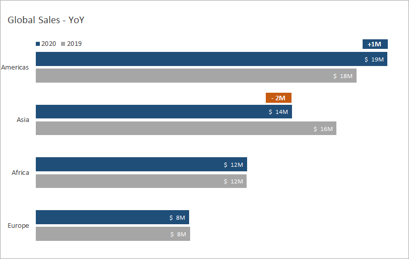
8. Descriptive titles, subtitles, and description
Use text sparingly on charts. However, they are a great way to tell your message and remove any confusion directly.
I place the title and optionally the subtitle at the top left of the chart. Since I don't want these elements to get immediate attention, I use gray font color with significant bits bolded.
I put any descriptions in a small font size at the bottom of the chart. They don't play any primary role in conveying my story. Hence it should be de-emphasized.
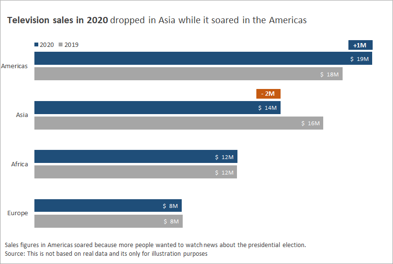
This version is easily more readable than the one we initially had. Our attention goes to the orange-color -2M label at once. That tells something is wrong with Asia. Then we move to the +1M label and think, "Americas doing good, however."
As there are no more attention-seeking elements, we revert to the top left corner for natural eye movement. The title says what this chart is about — television sales in 2020.
The legend that follows the title tells us the blue bars are 2020 sales. And now everything starts to make sense. Additional notes at the bottom explain the reason, source, etc.
9. Test before presenting
No matter how hard you worked on simplifying things, there is a chance you aren't conveying the message correctly. Hence it is always good to show your work to somebody who shares similar characteristics with your audience.
I usually ask a couple of colleagues to tell a story by looking at the chart. Most could come up with the story I intend to convey. And it usually takes about 10–15 seconds. Still higher than the 8-seconds goal. If they take longer or couldn't come up with a story at all, I rework it.
Conclusion
One picture is worth a thousand words — Fred R. Barnard.
We use charts everywhere to tell our stories. But often, we think of them as supporting materials, whereas they could play a more significant role.
A great chart will tell the story by itself, and the presenter's role is supportive.
In this article, we've seen many ways we could clean up and organize a chart to capture the reader's attention quickly and drive them through the story:
- We used 2D charts and not 3D;
- preferred the white background as opposed to a dark background;
- leveraged the natural eye movement of left-to-right and top-to-bottom;
- removed redundant elements such as grids, axes, and used data labels in their place;
- used grayscale mostly and used blue to highlight and orange to get immediate attention;
- made use of visual hierarchical properties such as size, proximity, typeface, and typography;
- used supporting elements to drive focus;
- used descriptive titles, subtitles, and description.
Finally, we acknowledged that testing with real people before pitching to the audience is critical for a useful chart.
This article is mainly suited for a chart on presentation slides. If it's on a dashboard or for charts used in data exploration, the approach may differ. However, some of the concepts could still be used in those contexts.
Source: https://towardsdatascience.com/9-easy-steps-to-make-great-charts-33e2c4612e39
Publicar un comentario for "What is the Best Way to Make Sure Graphs Are Easy to Interpret"